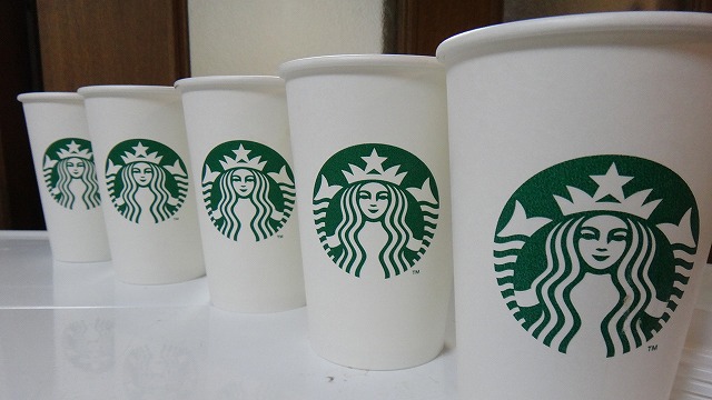
As you may know, the Starbucks logo was updated last year. The new mark looks much more simple. Kind of too simple. The ring around Siren was removed, so in other words, the Siren has been released from the ring.
One day our blogger, Mr. O, had a sudden impulse to draw something more surrounding the Siren.
Left: old version with the ‘Starbucks Coffee’ logo / Right: simple new version.
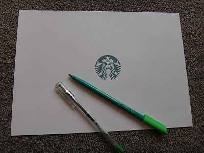
Mr. O prepares green pens and a piece of paper
featuring the new version trademark.
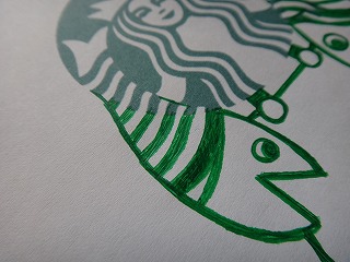
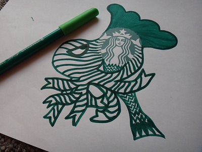
The first thing Mr. O adds around the logo is a fish!
Haha XD. Now our heroine looks like a woman working at a fish market.
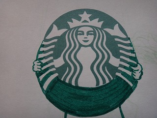
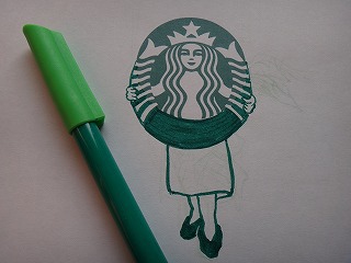
“Hello, customers. This is our newly released toilet seat.”
Now she looks like the sales manager for a toilet seat maker LOL.
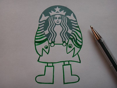
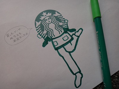
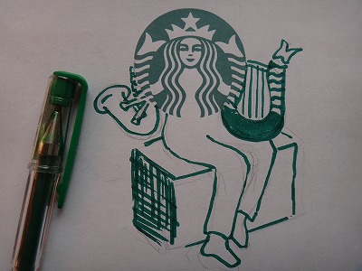
She is sometimes a boot artisan and at other times…
a musician!
And on another occasion she risks her life in the ocean.
(An octopus monster is trying to eat her…)
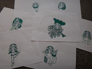
Now Mr. O has an impressive Siren art collection.
But it’s not enough for him. He makes another attempt.
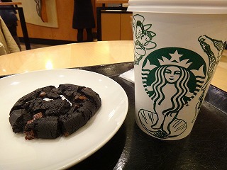
Mr. O visits Starbucks Coffee with a cup from his Seiren art collection.
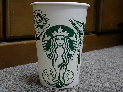
This is his selection for the day.
Reminds me of a very famous art work. (The Birth of Venus?)
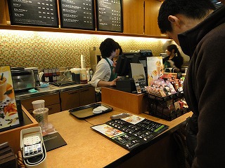
Mr. O hands the cup to the barista and orders coffee with downcast eyes.
Oh! Finally!
Mr. O is a good customer and a clever illustrator. Maybe Starbucks should consult with him the next time they give the siren an official makeover 😉
Source: Daily Portal Z
This is JAPAN Style!







![[Photoblog] Lily Dance](http://www.japanstyle.info/wp-content/uploads/2014/06/20140619_photoblog_lily-dance-65x65.jpg)

Recent Comments