In a past post, I introduced “phonetikana” which are katakana with the pronunciations on them. Today, I want to show you another unique Japanese character graphics by a different designer.

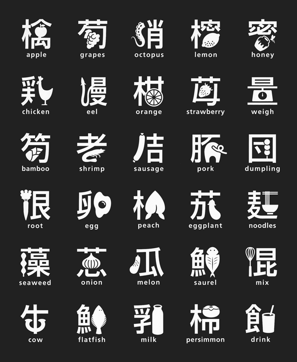
This is a kanji system created by a Japanese graphic designer, Masaaki Hiromura.
It’s a sign system which consists of kanji and illustration that represents the kanji. It is not only unique but also easy to understand for foreigners.
Let’s compare the kanji sign system and the actual kanji characters.


Kanji signs are simplified but still keep the original structures so that, we can read them right. And they are cool as art. I especially like the noodle sign. Which one do you like?
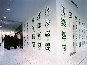
The signs were actually used at Shokuyu-kan (food floor) at Marui department store in Kita-Senju, Tokyo. (I am not sure if they are still there though.) The signs were also printed on its plastic bags.

The designer talked about how he came up with the idea.
“At the orientation at work, I was told, ‘There are many foreigners in Kita-Senju now. But in the daytime, there are mostly grandpa, grandma, and children in the town.’ So I thought about something that everyone can enjoy, and came up with this idea.” (Earth University, creative #2: Designing a semantic context)”
I think children do enjoy the signs, which may good to help them learn kanji and English.
Source: Ruriiro Tradition
This is JAPAN Style!
You should follow me on Twitter.


Recent Comments